Logo with some points in a chart and erik de luca written
  • Home
  • Projects
  • Publications and Talks
  • About

On this page

  • Import data
    • Fixed Base Indices
    • Stock performance in the portfolio
    • Portfolio Creation
  • Decomposition historical series
  • Optimisation
    • MonteCarlo Simulation
    • Portfolio weights
    • Efficient frontier
  • Optimised portfolio
  • VaR: Value at Risk
  • Correlation

McGill International Portfolio Challenge

Finance
Time Series

International competition for the best portfolio in a fund plan, organized by McGill University, Canada.

Published

October 15, 2023

International competition for the best portfolio in a fund plan, organized by McGill University, Canada.

My aim was to find the best weights that could be used by a pension fund. The portfolio is composed by REITS, Commodities, CAT BOND, Dividends, Short term bonds, Cash and Inflation linked.

Import data

I built a dataset with tickers, categories and the initial weights of the portfolio.

Code
detailPortfolio =
  tibble(
    tickerList = c(
      "SPG",      # REITS
      "OHI",
      "CCOM.TO",      # Commodities
      "DBC",
      "FCX",
      "KSM-F6.TA",
      "0P0001MN8G.F",      # CAT BOND
      "CDZ.TO",      # dividend
      "NOBL",
      "NSRGY",
      "CNI",
      "WFAFY",
      "UU.L",
      "KO",
      "NVS",
      "NVDA", # nvidia no dividendi
      # short term bond -- in truth they are etfs that reproduce the trend
      # "SHY",  
      # "VGSH",
      "SPTS",
      "IBGS.AS",
      # cash -- I placed a Canadian dollar future to represent liquidity
      "6C=F",      
      "XGIU.MI"     # Inflation linked
    ),
    category = c(
      rep("REITS",2),
      rep("Commodities",4),
      rep("CAT BOND",1),
      rep("Dividends",9),
      rep("Short term bonds",2),
      rep("Cash",1), 
      rep("Inflation linked",1) 
    ),
    weight = c(
      .08,
      .06,
      .046,
      # comodities
      .009,
      .01,
      .057,
      .07,
      # cat bond
      .02,
      # div
      .06,
      .02,
      .01,
      .017,
      .005,
      .005,
      .05,
      .023,
      # .07,
      # .07,
      .05,
      .128,
      .15,
      # .00,
      .13
    )
  )
detailPortfolio |> 
  summarise(
    across(weight, sum, na.rm = TRUE),
    .by = category
  ) |> 
  gt() |> 
  fmt_percent(vars(weight), decimals = 1)
category weight
REITS 14.0%
Commodities 12.2%
CAT BOND 7.0%
Dividends 21.0%
Short term bonds 17.8%
Cash 15.0%
Inflation linked 13.0%

Fixed Base Indices

Import data from Yahoo Finance for the last 5 years and construct the portfolio without the weights of each stock.

Code
stockData = lapply(detailPortfolio$tickerList,
                     getSymbols,
                       src = "yahoo",
                       from = as.Date("2018-09-30"),
                       to = as.Date("2023-09-29"),
                       auto.assign = F
                     )
saveRDS(stockData, "data/stockData.rds")
Code
stockData = readRDS("data/stockData.rds")

# fix tickets that have changed name during import
detailPortfolio |> 
  mutate(
    tickerList = case_when(
      tickerList == "KSM-F6.TA" ~ "KSM.F6.TA",
      tickerList == "6C=F" ~ "X6C",
      TRUE ~ tickerList
    )
  ) -> detailPortfolio

# compact the different lists
nominalPortfolio = do.call(merge,stockData) %>% 
  na.omit()

# the CAT BOND is volume-free
nominalPortfolio$X0P0001MN8G.F.Volume = 1

for(i in 1:nrow(detailPortfolio))
{
  columnSelect = (!names(nominalPortfolio) %like% "Volume") &
    names(nominalPortfolio) %like% detailPortfolio$tickerList[i]
  nominalPortfolio[,columnSelect] = nominalPortfolio[,columnSelect] / 
    rep(coredata(nominalPortfolio[1,columnSelect])[1],5) 
}

as_tibble(nominalPortfolio)
Code
grafico = highchart(type = "stock")
for(i in 1:nrow(detailPortfolio))
  grafico = hc_add_series(grafico, 
                          Cl(nominalPortfolio[,names(nominalPortfolio) %like%
                                                detailPortfolio$tickerList[i]]),
                          name = detailPortfolio$tickerList[i])
grafico

Stock performance in the portfolio

I add the initial portfolio weights.

Code
portfolio = nominalPortfolio

for(i in 1:nrow(detailPortfolio))
{
  columnSelect = (!names(portfolio) %like% "Volume") &
    names(portfolio) %like% detailPortfolio$tickerList[i]
  portfolio[,columnSelect] = 
    coredata(nominalPortfolio[,columnSelect]) * detailPortfolio$weight[i] 
}

as_tibble(portfolio)
Code
grafico = highchart(type = "stock")
for(i in 1:nrow(detailPortfolio))
  
  grafico = hc_add_series(grafico, 
                          Cl(portfolio[,names(portfolio) %like% 
                                         detailPortfolio$tickerList[i]]),
                          name = detailPortfolio$tickerList[i]) 
grafico

Portfolio Creation

I create the portfolio by adding up the indices of the stocks multiplied by their weights. This gives the overall performance of the portfolio.

Code
columnNames = c("Open", "High", "Low", "Close", "Volume", "Adjusted")
myPortfolio = matrix(NA, nrow(portfolio),ncol = length(columnNames))

for(i in 1:length(columnNames))
{
  columnSelect = names(portfolio) %like% columnNames[i]
  myPortfolio[,i] = sapply(1:nrow(portfolio), 
                           function(r) sum(coredata(portfolio[r,columnSelect])))  
}

colnames(myPortfolio) = paste("Portfolio", columnNames, sep = ".")
myPortfolio = xts(myPortfolio, order.by = index(portfolio))

as_tibble(myPortfolio)
Code
p = myPortfolio %>% 
  fortify() %>% 
  ggplot(aes(x = Index, y = Portfolio.Open)) + 
  geom_smooth(method = "gam",
              formula = formula(y ~ s(x)),
              fill = pal[5],
              aes(color = pal[5]),
              alpha = .3) +
  geom_line(color = pal[3]) +
  geom_pointrange(aes(ymin = Portfolio.Low, 
                    ymax = Portfolio.High), 
              alpha = 0.22,
              fill =  'turquoise1',
              size = .1) +
  # geom_col(aes(y = Portfolio.Volume),inherit.aes = F) +
  xlab("") +
  ylab("") +
  scale_y_continuous(labels = function(x) scales::percent(x-1)) +
  scale_color_manual(values = pal[5],
                     labels = "Prediction of portfolio trends using splines") +
  theme(legend.position = "bottom",
        legend.title = element_blank())

p

Code
# ggplotly(p)

Decomposition historical series

I decompose the historical series to display its different components.

Code
pfDecomposto = decompose(ts(myPortfolio$Portfolio.Open %>% as.vector(),
                            start = c(2022, 9, 29),
                            # end = c(2023, 09, 28),
                            frequency = 7))
# plot(pfDecomposto)
p = tibble(Dates = seq(as.Date("2022-09-29"),
                   length = length(pfDecomposto$x),
                   by =  "days"),
       Serie = pfDecomposto$x %>% coredata(),
       Seasonal = pfDecomposto$seasonal %>% coredata(),
       Trend = pfDecomposto$trend %>% coredata(),
       Random = pfDecomposto$random %>% coredata()) %>% 
  gather(key = "Type", -Dates, value = "y") %>% 
  ggplot(aes(x = Dates, y = y)) + 
    geom_line() +
    facet_grid(rows = vars(Type), 
               scales = "free_y") +
  ylab("")  +
  scale_x_date(date_breaks = "1 month",
               date_labels = "%b")

ggplotly(p, dynamicTicks = TRUE) %>%
  # rangeslider() 
  plotly::layout(hovermode = "x")

Optimisation

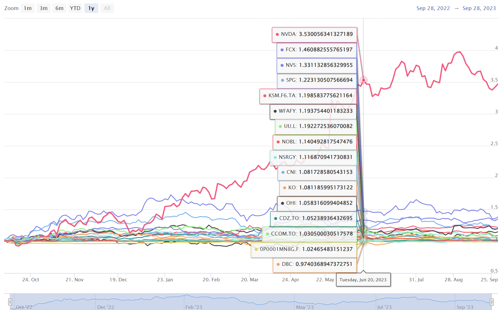
The current portfolio has these indices, our goal now is to optimise the portfolio to maximise the sharpe rato index, i.e. to maximise the portfolio’s return while minimising its risk.

Code
nominalPortfolioAdj = 
  nominalPortfolio[,names(nominalPortfolio) %like% "Adjusted"] %>%
  CalculateReturns() %>% 
  to.yearly.contributions() %>% 
  na.omit()

weight = detailPortfolio$weight

nominalPortfolioAdj = 
  nominalPortfolioAdj[,names(nominalPortfolioAdj) != "Portfolio Return"]

mean_ret = colMeans(nominalPortfolioAdj)

cov_mat = nominalPortfolio[,names(nominalPortfolio) %like% "Adjusted"] %>%
  CalculateReturns() %>% 
  to.quarterly.contributions() %>% 
  na.omit() %>% 
  cov()

# solo quando i volumi non sono degeneri

return3mesi = nominalPortfolio[,!names(nominalPortfolio) %like% "Volume"] %>%
  CalculateReturns() %>%
  to.period.contributions("quarters") %>%
  na.omit()

var3m = VaR(R = return3mesi[,names(return3mesi) %like% "Adjusted"],
            method = "historical",
            portfolio_method = "component",
            weights = weight)

port_risk = var3m$hVaR

cov_mat = cov_mat[rownames(cov_mat) != "Portfolio Return",
                  colnames(cov_mat) != "Portfolio Return"]

port_returns = sum(mean_ret * weight)

port_risk = sqrt(t(weight) %*% (cov_mat %*% weight))

sharpe_ratio = port_returns/port_risk

tibble("Return" = port_returns,
       "Risk" = port_risk,
       "VaR a 3 mesi" = var3m$hVaR,
       "Sharpe ratio" = sharpe_ratio) |> 
  gt() |> 
  fmt_percent(columns = 1:3) |> 
  fmt_number(columns = 4, decimals = 2)
Return Risk VaR a 3 mesi Sharpe ratio
6.77% 2.28% −0.96% 2.98

MonteCarlo Simulation

A simulation will be carried out using the MonteCarlo method where the experiment will be repeated by randomly extracting the weights, thus finding the best portfolio combination. In this case, the experiment will be repeated 5000 times but the portfolio weights will not be completely random, they will vary around the values we preset.

Code
set.seed(1)
num_port = 5000

# Creating a matrix to store the weights
all_wts = matrix(nrow = num_port,
                  ncol = nrow(detailPortfolio))

# Creating an empty vector to store
# Portfolio returns
port_returns = vector('numeric', length = num_port)

# Creating an empty vector to store
# Portfolio Standard deviation
port_risk = vector('numeric', length = num_port)

# Creating an empty vector to store
# Portfolio Sharpe Ratio
sharpe_ratio = vector('numeric', length = num_port)

for (i in seq_along(port_returns)) {
  precisione = 0.9
  wts = sapply(1:length(weight), 
               function(i) runif(1,
                                 precisione * weight[i],
                                 (2 - precisione) * weight[i]))
  # wts = runif(length(tickerList))
  wts = wts/sum(wts)
  
  # Storing weight in the matrix
  all_wts[i,] = wts
  
  # Portfolio returns
  
  port_ret = sum(wts * mean_ret)
  # port_ret <- ((port_ret + 1)^252) - 1
  
  # Storing Portfolio Returns values
  port_returns[i] = port_ret
  
  
  # Creating and storing portfolio risk
  port_sd = sqrt(t(wts) %*% (cov_mat  %*% wts))

  # Più preciso ma ci mette troppo  
  # port_sd = VaR(
  #   R = return3mesi[, names(return3mesi) %like% "Adjusted"],
  #   method = "historical",
  #   portfolio_method = "component",
  #   weights = wts
  # )$hVaR

  port_risk[i] = port_sd
  
  
  # Creating and storing Portfolio Sharpe Ratios
  # Assuming 0% Risk free rate
  sr = port_ret/port_sd
  sharpe_ratio[i] = sr
}

Portfolio weights

The weights assigned by the portfolio with the highest sharpe ratio are shown in the interactive plot below.

Code
# Storing the values in the table
portfolio_values = tibble(Return = port_returns,
                  Risk = port_risk,
                  SharpeRatio = sharpe_ratio)


# Converting matrix to a tibble and changing column names
all_wts = all_wts %>%
  data.frame() %>%
  tibble
colnames(all_wts) = detailPortfolio$tickerList

# Combing all the values together
portfolio_values = tibble(cbind(all_wts, portfolio_values))
colnames(portfolio_values)[1:nrow(detailPortfolio)] = detailPortfolio$tickerList

min_var = portfolio_values[which.min(portfolio_values$Risk),]
max_sr = portfolio_values[which.max(portfolio_values$SharpeRatio),]

# weightOLD = weight
weight = max_sr[,1:nrow(detailPortfolio)] %>% 
  as.numeric() %>% 
  round(4) 

# con l'arrotondamento potrebbe non fare 1 e lo calibro con il primo titolo, 
# ciò non influenzerà significativamente sullo scostamento del portafoglio
weight[1] = weight[1] + 1 - sum(weight)

# max_sr %>% 
#   t() %>%
#   data.frame()

p = max_sr %>%
  gather(detailPortfolio$tickerList, key = Asset,
         value = Weights) %>%
  cbind(Category = factor(detailPortfolio$category)) %>% 
  mutate(Asset = Asset %>%
           as.factor() %>% 
           fct_reorder(Weights),
         Percentage = str_c(round(Weights*100,2), "%")) %>%
  ggplot(aes(x = Asset,
             y = Weights,
             fill = Category,
             label = Percentage)) +
  geom_bar(stat = 'identity') +
  geom_label(nudge_y = .01, size = 3) +
  theme_minimal() +
  labs(x = 'Tickers',
       y = 'Weights',
       title = "Weights of the portfolio tangent to the efficient frontier") +
  scale_y_continuous(labels = scales::percent) +
  guides(fill = guide_legend(override.aes = aes(label = ""))) + 
  theme(legend.position = "bottom") +
  coord_flip()

ggplotly(p)

Efficient frontier

The graph below shows the values of the portfolios created during the optimisation process. The red dot represents the portfolio with the highest sharpe ratio.

Code
p = portfolio_values %>%
  ggplot(aes(x = Risk, y = Return, color = SharpeRatio)) +
  geom_point() +
  theme_classic() +
  scale_y_continuous(labels = scales::percent) +
  scale_x_continuous(labels = scales::percent) +
  labs(x = 'Annual risk',
       y = 'Annual return',
       title = "Portfolio optimization and efficient frontier") +
  geom_point(aes(x = Risk,
                 y = Return),
             data = max_sr,
             color = 'darkred') 

ggplotly(p)

Optimised portfolio

Code
# I recreate the portfolio with the new weights
portfolio = nominalPortfolio

for(i in 1:nrow(detailPortfolio))
{
  columnSelect = (!names(portfolio) %like% "Volume") & 
    names(portfolio) %like% detailPortfolio$tickerList[i]
  portfolio[,columnSelect] = 
    coredata(nominalPortfolio[,columnSelect]) * weight[i] 
}

columnNames = c("Open", "High", "Low", "Close", "Volume", "Adjusted")
myPortfolio = matrix(NA, nrow(portfolio),ncol = length(columnNames))

for(i in 1:length(columnNames))
{
  columnSelect = names(portfolio) %like% columnNames[i]
  myPortfolio[,i] = sapply(
    1:nrow(portfolio), 
    function(r) sum(coredata(portfolio[r,columnSelect])))  
}

colnames(myPortfolio) = paste("Portfolio", columnNames, sep = ".")
myPortfolio = xts(myPortfolio, order.by = index(portfolio)) 

myPortfolio %>% 
  fortify() %>% 
  mutate(across(starts_with("Portfolio"), \(x) x/dplyr::first(x))) %>%
  ggplot(aes(x = Index, y = Portfolio.Open)) + 
  geom_smooth(method = "gam",
              formula = formula(y ~ s(x)),
              fill = pal[5],
              aes(color = pal[5]),
              alpha = .3) +
  geom_line(color = pal[3]) +
  geom_pointrange(aes(ymin = Portfolio.Low, 
                      ymax = Portfolio.High), 
              alpha = 0.22,
              fill = 'turquoise1',
              size = .1) +
  # geom_col(aes(y = Portfolio.Volume),inherit.aes = F) +
  xlab("") +
  ylab("") +
  scale_y_continuous(labels = function(x) scales::percent(x)) +
  scale_color_manual(values = pal[5],
                     labels = "Prediction of portfolio trends using splines") +
  theme(legend.position = "bottom",
        legend.title = element_blank())

VaR: Value at Risk

In the following graph, the different securities are shown with their yield, their variance on the abscissa and are coloured according to their coefficient of variation. This graph helps in the choice of initial weights (pre-optimisation) as it is easy to visualise those that perform best.

Code
returnTicker = 
  map_dfc(
    detailPortfolio$tickerList,
    ~dailyReturn(Cl(nominalPortfolio[,names(portfolio) %like% .x]))
  )
colnames(returnTicker) = detailPortfolio$tickerList

returnTickerIndici = returnTicker %>% 
  as.tibble() %>%
  summarise_all(sum) %>% 
  pivot_longer(
    1:nrow(detailPortfolio),
    names_to = "Titoli",
    values_to = "Rendimento"
    )  %>% 
  add_column(returnTicker %>%
               as.tibble() %>%
               summarise_all(sd) %>%
               pivot_longer(
                 1:nrow(detailPortfolio),
                 names_to = "Titoli",
                 values_to = "Varianza"
                 ) %>% 
               dplyr::select(Varianza)
             ) %>% 
  mutate(Variazione = ifelse(round(Rendimento, 2) != 0,
                             Varianza/abs(Rendimento),
                             1)) 

hValMin = 1.8 # giocando con questo parametro si cambia l'asse delle y
# modificando la distanza dei punti estremi ai punti centrali
hValMax = 1

p = returnTickerIndici %>%
  mutate(quantili = punif(Rendimento,
                       min = hValMin * min(Rendimento), # se non metto hvalmin
                       # il min di Rendimento vale 0 e di conseguenza il log
                       # tende a meno infinito
                       max = hValMax * max(Rendimento),
                       log.p = T), 
    across(where(is.numeric), \(x) round(x, 4)),
    # across(vars(Rendimento), )
  ) |> 
  ggplot(aes(y = quantili,
             x = Varianza,
             color = Variazione,
             label = Titoli,
             z = Rendimento #serve solo per l'etichetta nel grafico interattivo
             )) +
  geom_point(size = 1.5) + 
  scale_color_distiller(palette = "RdYlGn", direction = -1) +
  scale_x_log10(labels = scales::percent_format(accuracy = .2),
                breaks = scales::breaks_log(n = 10, base = 10)) +
  scale_y_continuous(
    labels = function(x) scales::percent(
      qunif(x,
            min = hValMin * min(returnTickerIndici$Rendimento),
            max = hValMax * max(returnTickerIndici$Rendimento),
            # associo i valori originali invertendo la funzione di ripartizione
            log.p = T), 
    scale = 1
    ),
                     breaks = scales::pretty_breaks(10)) +
  labs(x = "Variation", y = "Return", color = "Coefficient \nof variation") +
  theme(legend.position = "right", 
        legend.title.align = 0) 


ggplotly(p, tooltip = c("z", "x", "color", "label"))
Code
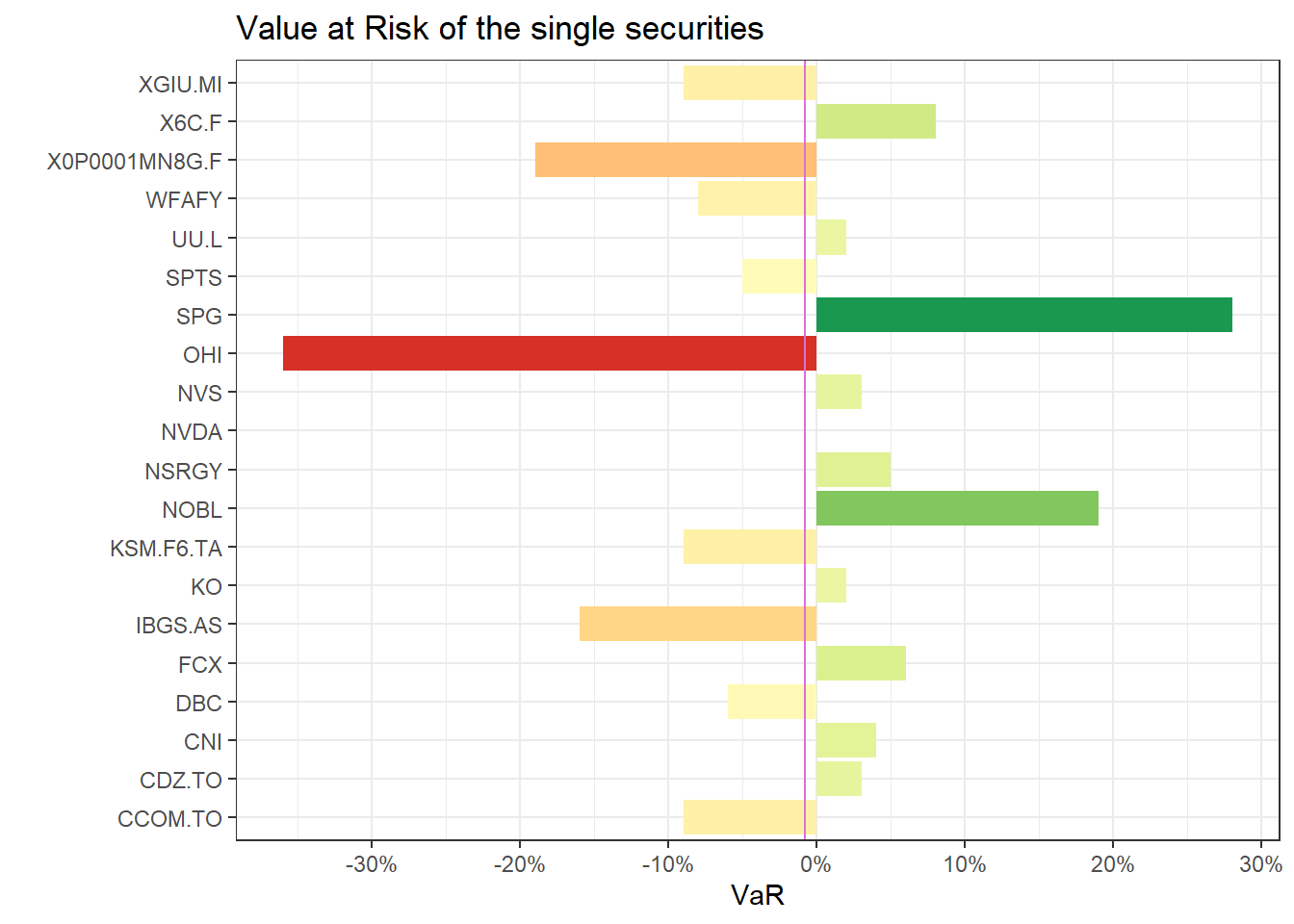
return3mesi = nominalPortfolio %>% 
  CalculateReturns %>% 
  to.period.contributions("quarters")


weight_max_sr = max_sr %>% 
      t() %>% 
      head(nrow(detailPortfolio)) %>% 
      as.vector()

VaR(return3mesi[,names(return3mesi) %like% "Open"],
    method = "historical",
    weights = weight_max_sr,
    portfolio_method = "marginal") %>% 
  pivot_longer(1:length(weight_max_sr) + 1,
               names_to = "Titoli",
               values_to = "VaR") %>%
  mutate(VaR = round(VaR *100, 2)) %>% 
  ggplot(aes(x = Titoli, y = VaR, fill = VaR)) +
  geom_col() +
  geom_hline(aes(yintercept = PortfolioVaR), color = "orchid") +
  coord_flip() + 
  scale_fill_distiller(palette = "RdYlGn", direction = 1) +
  theme(legend.position = "none") +
  scale_x_discrete(labels = function(x) str_remove(x,".Open")) +
  labs(
    x = "",
    title = "Value at Risk of the single securities",
    ) +
  scale_y_continuous(labels = scales::percent_format(),
                     breaks = scales::pretty_breaks(8))

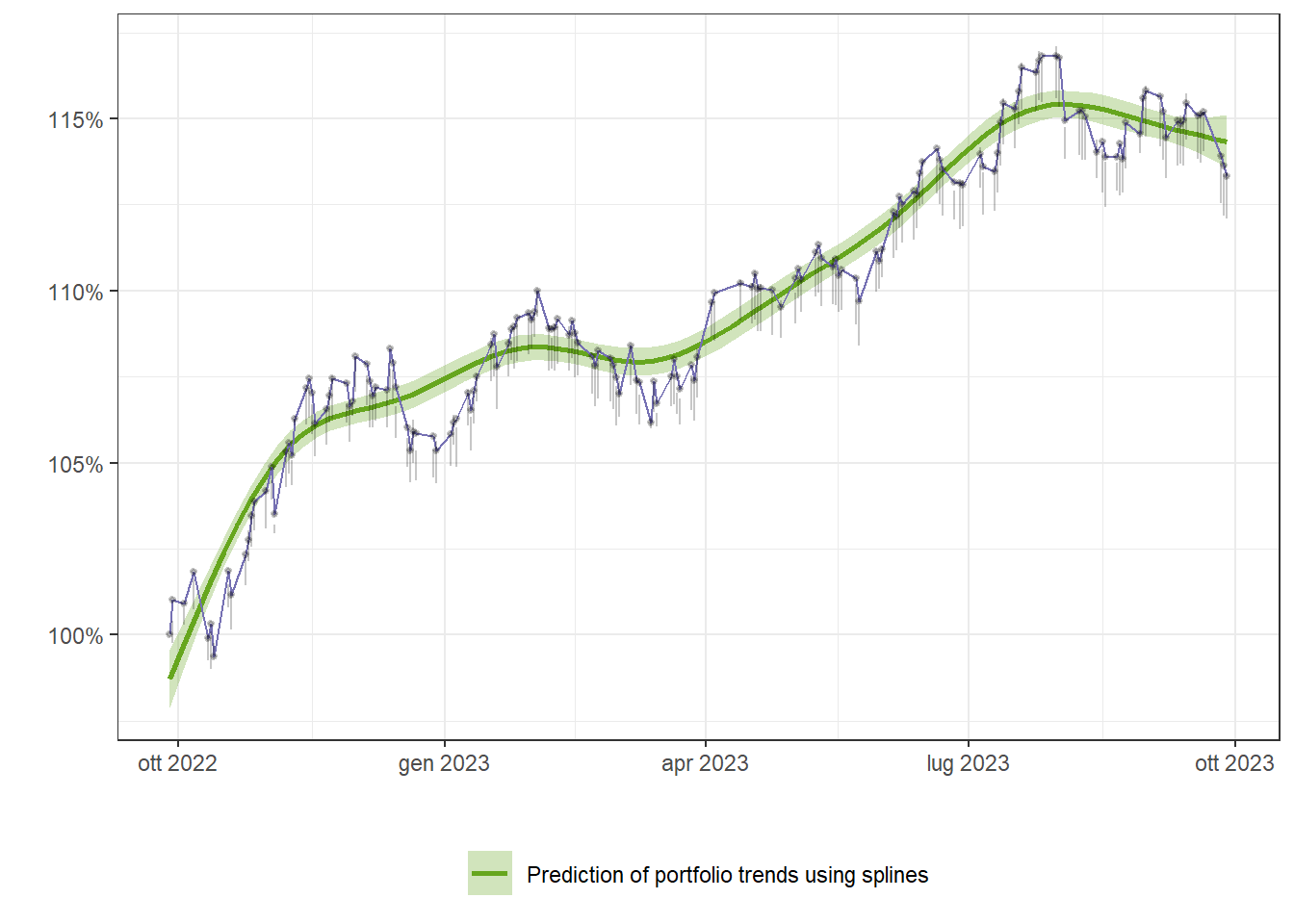
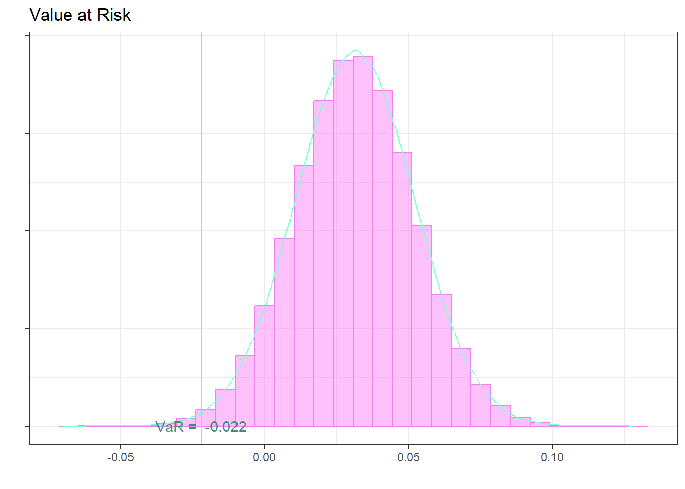
The following histogram shows the simulation of 1000000 samples taken from a normal of mean equal to the portfolio return on a four-monthly basis and the variance equal to the portfolio variance on a four-monthly basis.

Code
alpha = 0.005

media = sapply(1:nrow(return3mesi), function(i)
  sum(return3mesi[i, names(nominalPortfolio) %like% "Adjusted"]
      * weight_max_sr)) %>%
  mean(na.rm = T)

varianza = sapply(1:nrow(return3mesi), function(i)
  sum(return3mesi[i,names(nominalPortfolio) %like% "Adjusted"]
      * weight_max_sr)) %>%
  sd(na.rm = T)

set.seed(1)
df = data.frame(x = rnorm(1E6, media, varianza))
ggplot(df, aes(x, ..density..)) +
  geom_histogram(color = "violet",
                 fill = "orchid1",
                 alpha = .5,
                 bins = 30) +
  geom_density(color = "aquamarine") +
  geom_vline(xintercept = quantile(df$x, probs = alpha),
             color = "aquamarine2") +
  annotate('text',
           x = quantile(df$x, probs = alpha),
           y = 0.01,
           color = "aquamarine4",
           label = paste("VaR = ",df$x %>% 
                           quantile(probs = alpha) %>% 
                           round(4))) +
  scale_y_continuous(labels = NULL) +
  labs(
    x = "",
    y = "",
    title = "Value at Risk",
    )

Correlation

The correlation chart is useful to see the diversification of the portfolio.The plot is interactive, so you can zoom in and out to see the details.

Code
correlazione = return3mesi[,names(return3mesi) %like% "Adjusted"] %>% 
  na.omit %>% 
  cor

colnames(correlazione) = stringr::str_remove(colnames(correlazione),".Adjusted")
rownames(correlazione) = stringr::str_remove(colnames(correlazione),".Adjusted")

# Funzione personalizzata per etichette colorate
color_labels = function(labels, colors) {
  mapply(function(label, color) {
    as.expression(bquote(bold(.(color)(.(label)))))
  }, labels, colors, SIMPLIFY = FALSE)
}

p = correlazione %>% 
  reshape2::melt() %>% 
  ggplot(aes(x=Var1, y=Var2, fill = value, color = value)) + 
  geom_tile() +
  scale_fill_distiller(name = "Correlation",
                       palette = "RdYlGn",
                       direction = 1) +
  # geom_label(aes(label = round(value,2)), size =2,label.size = 0) +
  scale_x_discrete(limits = rev(rownames(correlazione))) +
  # Imposta color su NULL per nasconderlo
  guides(color = guide_legend(override.aes = list(color = NULL))) +  
  theme(axis.title = element_blank(),
        axis.text.x = element_text(angle = 30,vjust = .95, hjust = .95))

ggplotly(p)

DE LUCA ERIK, P.IVA: IT01401250327
Sede legale: Via dei Giardini, 50 - 34146 - Trieste

Copyright 2024, Erik De Luca

Cookie Preferences

This website is built with , , and Quarto